Planet maemo: category "feed:c63f96fde7b268f5cfc832a181221610"

Andrew Zhilin

2010 UI countdown. #4 – Mer Menu

2009-12-27 18:30 UTC  by  Andrew Zhilin
0
0

Good evening.

As I promised, today I’ll show you my interface concept for Mer applications/task swithcing menu, or simply Mer Menu. Details after the break.

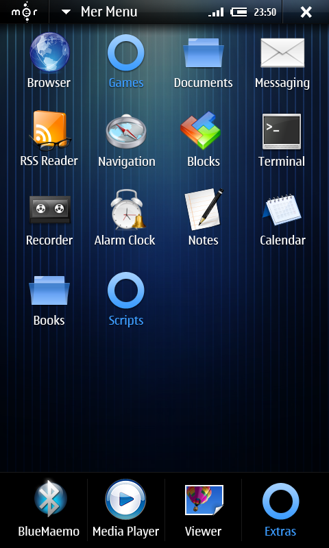
First of all we need a scalable menu that will work in both portrait and landscape modes. Also I’ve added a quick launch area (like “Dock” on the iPhone) that will appear even if task switcher is launched for immediate acces for hot apps like phone or anything else. Then, I thought that it would be great to add shortcuts not only to the applications but also for different folders. And return categories for better organisation. So as a result we’ll have something like this:

Quick launch area, pannable applications area. Blue circles are categories. You can set up menu thru hildon menu, just like any other app or homescreen. That’s how it will look in portrait mode:

And this is how task switcher will look like:

Well, that’s all for now, tomorrow I’ll show some thoughts about statusbar area. Thanks for reading and see you tomorrow.


Categories: Mer
Andrew Zhilin

2010 UI countdown. #5 – Mer Statusbar

2009-12-26 20:50 UTC  by  Andrew Zhilin
0
0

Hello everybody.

Today I’d like to continue my countdown series with a pack of posts about user interface concepts for one of the most global maemo community project ever been done — Mer. Thanks to Stskeeps and his great administrative skills, along with all great developers involved, community now has its own way to stay updated with an old hardware like n800/810. So, I’d like to show you fresh thoughts bout visual appearance of Mer in 2010. Lets start with statusbar.

So, the main goal of user interface optimizations was to allow Mer to be usable in as many different environments as possible. That’s why I’ve decided to make it button-independent so you’ll need only touch screen to manipulate. Then I thought it would be great to give user as much screen space as possible for desktop applications, that you can run with Mer (the whole god-damn Ubuntu repository!). Also Mer UI should not be very different frome Fremantle, cause Mer should support all the apps made for Hildon environment. And the last thing — Mer should be usable in portrait modes and even low resolution screens without sacrificing functionality. So I came up with this:

As you can see, statusbar is a bit thinner now, but you can still reach it with fingers even on n900 screen (it’s even easier cause n900 screen doesn’t have bezel around). There’s Mer button, that acts the same way as applications/task switcher button in fremantle, Window title (yeah, it’s back :), shortened status area (tap it to see all of the system status, also you can set up what 3 widgets will be displayed there) and close/back button.

You can share your opinions here right now, and tomorrow I’ll take a closer look at Mer Menu. Thanks for reading.


Categories: Mer
Andrew Zhilin

2010 UI countdown. #6 – XChat

2009-12-25 17:01 UTC  by  Andrew Zhilin
0
0

Good evening everyone.

Today I’d like to show you interesting user interface concept for extremely popular IRC messenger called Xchat. As you remember, it never had properly hildonized interface so I thought that it would be cool to design something for it.

Check out the concept after the break.

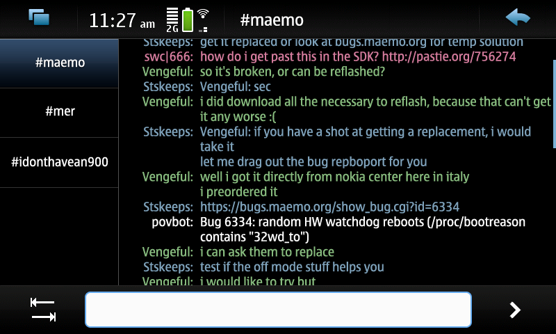
This is the main window. As you can see, now it looks more natural. Every user has its own colour for better clearance. Also “Tab” button was added cause it’s pretty functional in IRC but you don’t have one on your hardware keyboard. But there’s one problem – this fontsize helps you to see more but it’s too small for finger manipulations. That’s where I come in :) Tap somewhere in the text where the part you’re interested in is located and you’ll get into zoomed mode.

Now you can see enlarged text with timestsamps. And you can easily tap the part you need.

On tap you’ll see text input window and three options, copy selected text, copy all text quickly and open link (if there is one)

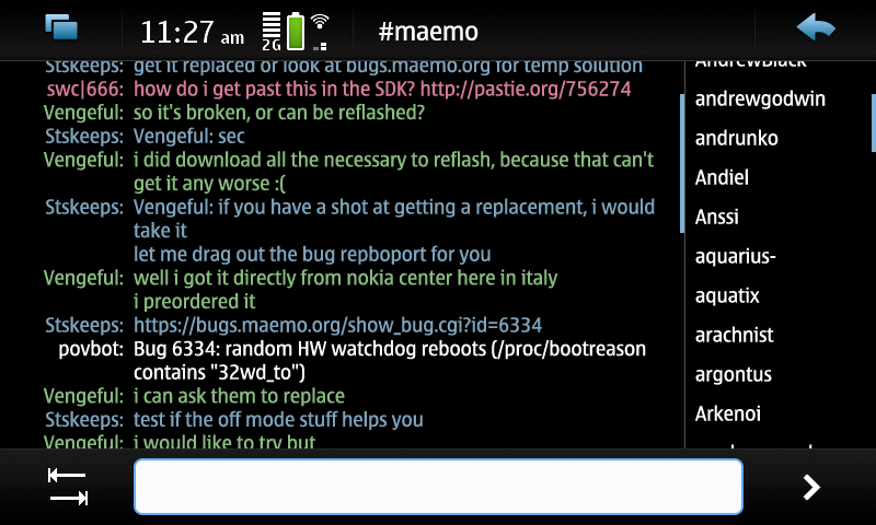
But lets get back to the main window. Now we need some intuitive way to switch between channels and user-selection. I thought that swipes from left and right would fit very nicely for this purpose. Left for channels:

And right for users:

Well, that’s all for now, hope you’ll like this concept. Thanks for reading and see you tomorrow.

Categories: Design guidelines
Andrew Zhilin

2010 UI countdown. #7 – Marina Theme

2009-12-24 20:48 UTC  by  Andrew Zhilin
0
0

Hello everyone and Merry Christmas for those who celebrating it!

Today I’d like to tell you bout thing that you probably heard of – a theme for Maemo5/Mer called Marina. Thanks to Urho Konttori and his awesome updated Theme Maker – you can make pretty remarkable stuff for Maemo 5. Every widget and every background is changeable. But as for me, insane perfectionist, uber-customizability of Maemo 5 UI takes much time to draw something complex and unique, since you need to change huge ammount of data. Nevertheless, I’ve found some time to work on one theme and I called it “Marina”.

Details after the break :)

So, the goal was to show user as slick UI as possible, without overacting wth gloss. Something non-distracting but with its “soul”, unique style. After many changes you’ll soon see something like this:

As you can see, buttons became a bit subliminal, you see them but they don’t want you to stare at them. Also calm green and blue colors instead of bright makes the look solid.

And as it’s Christmas here, I have a very small, but handmade present for all of you – since Marina will be backed with proper “Mer’ish” loopable wallpaper – I want to give it to you right now :)

1.

2.

3.

4.

Well, that’s all for now, Merry Christmas again, happy celebrating, hope to see you tomorrow, more cool stuff will be waiting for you :) And thanks for reading ;)


Categories: Mer
Andrew Zhilin

2010 UI countdown. #8 – Personal Clock.

2009-12-23 17:15 UTC  by  Andrew Zhilin
0
0

Hello everyone.

Another day is over and it’s time for some exciting stuff from me :)

Today I’m gonna show you a brief preview of the new homescreen widget for n900. It’s dead simple but I hope you’ll like it. It’s called Personal Clock and we’re developing it with, orly :D, Andrew Olmsted . Details, as always, after the break.

So, the main purpose is to show large, shiny analog/digital clock on your homescreen, so you can use it with kickstand on your table or just comfortably check the time on the go.

But the most interesting feature is ultimate customizability. Basically, the only limitations you’ll have are widget size (680×370 for digital and 370×370 for analogue) and clock behaviour. Widget is drawn with multiple .png layers so you can easily draw your own skin if you want to. You don’t even need to build .debs or other stuff, just put properly named layers into the tar.gz archive along with information file and load it thru the UI. Layers structure looks like this:

All layers are 370×370 so you can draw virtually any skin you want with any type of background, hands or foreground. You can start to design your skins right now by the way ;)

That’s it for now, thanks for reading and see you tomorrow.


Categories: Design guidelines
Andrew Zhilin

2010 UI countdown. #9 – Extras Assistant .

2009-12-22 19:39 UTC  by  Andrew Zhilin
0
0

Good evening everyone!

One more day is over and we’re getting closer to the new year. I’ve prepaired some really cool stuff for you today — it’s called “Extras Assistant”. We’re developing it with great Nokian Daniel Wilms and his crew. The purpose of this app is to provide additional comfort and ease to the maemo.org Extras browsing, no matter what version of Maemo you’re using. Tasty shots and bref descriptions after the break.

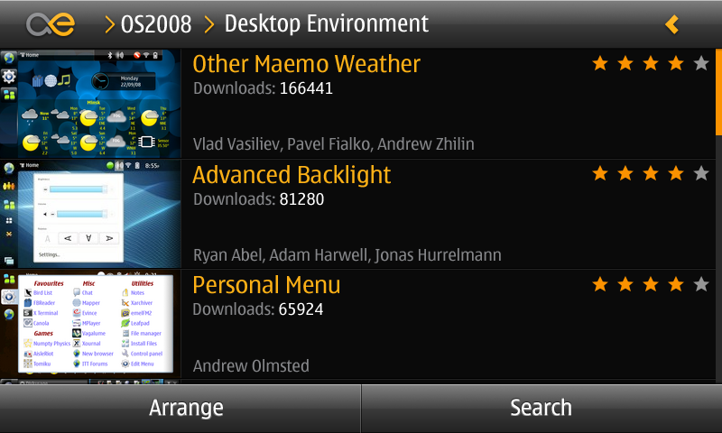
So, you’ll have all functions of the browser version with some modern favour of touch user interface. For example, list of apps in Desktop Environment category will look like this.

That should remind you maemo5 ui, but with some changes. Tap the maemo.org logo to go straight to the homepage, tap’n'hold to minimize. You can go one step back by pressing, you know, “back” :) Also you can rearrange the list (by downloads count, rating, alphabet and so on) or search within the category for stuff. When you’ll tap the item, you’ll see something like this:

Here you can see all possible info bout the application, including screenshots. And, obviously, you can install it from here :) As for the comments, we have separate screen to show them, where you can add your own as well.

Since you need to be logged in into maemo.org to post comments – we have small panel to show your status. Log in, tap “comment”, set rating, type something and you’re done.

Well, that’s all for now, more things to come tomorrow, so stay tuned and thaks for reading :)

Categories: Released software
Andrew Zhilin

2010 UI countdown. #10 – Transmission.

2009-12-21 20:49 UTC  by  Andrew Zhilin
0
0

Hello everyone!

So, 2009 is coming to its end. Milestone for the whole Maemo ecosystem. I clearly remember that glorious day when Urho Konttori came to #maemo channel and said “Here we go!”. It was the release of maemo.nokia.com website. And the first thing I’ve said was “You know guys, I’m proud that I was here before today”. And I’m still very proud of it. For me, 2009 was a great year, I’ve, as always, helped various unique projects, such as Mnemosyne, BlueMaemo, Ati85 and even Mer. You can even see some of my UI ideas for Fremantle live now.

But life’s going on and the world is waiting for brand new 2010! I’m sure it will blow up our minds even more than 2009 and I want to tell you what you can expect in 2010 from me. So lets start our Annual Countdown with number 10 – Transmission!

So, thanks to qwerty12 now you can download torrents right to your n900 with Transmission. But current user interface is missing Maemo 5 HIG a bit (though work with app menu is really impressive) and it can’t be used for portrait mode (and we want portrait, right?) We’ve decided to remake UI so it would be great for all use cases. Please welcome, revamped Transmission :)

Now all info bout downloads is right on the main screen. Row dividers now also have the functionality of progress bars. Tap the row to see details. And, what’s more important – it looks perfect in portrait mode :)

Well, lets save some juice for release, that’s all for now. See you tomorrow – I have lots of things to show you.

Thanks for reading.

Categories: Design guidelines
Andrew Zhilin

Preview: FM radio for N900

2009-10-29 18:40 UTC  by  Andrew Zhilin
0
0

iconHello everybody.

Click to read 1032 more words
Categories: Released software
Andrew Zhilin

OMWeather 0.3 preview and support

2009-10-21 12:20 UTC  by  Andrew Zhilin
0
0

logo2Hello everyone.

Click to read 1252 more words
Categories: Released software
Andrew Zhilin

Preview: Mnemosyne for Maemo

2009-09-15 13:31 UTC  by  Andrew Zhilin
0
0

1Hello everybody.

Click to read 1074 more words
Categories: Released software
Andrew Zhilin

Fremantle: Swipe launch.

2009-09-14 00:06 UTC  by  Andrew Zhilin
0
0
Hello all. Just came up with little, but neat idea for Fremantle. It’s so little that I don’t even need “more…” tag :) As we’ve already seen on various videos, flush screen of the n900 allows to detect very first pixels of the display that opens up the door to some neat interactions for example roll-over mode [...]
Categories: Light UI modifications
Andrew Zhilin

Fremantle: Parallax Background

2009-09-13 01:40 UTC  by  Andrew Zhilin
0
0
Hello everyone. Today I’d like to show you my idea about Fremantle desktop behaviour. As you remember, now it has cool feature called “Panorama desktop” that allows you to scroll through 4 different desktops with a simple flick of the finger. That idea is not something extraordinary or brand new but it’s really useful. As for visualizing, [...]
Categories: Heavy UI improvements