

How-to Customizing and theming Maemo
This document is released under the GPL license.
Goal:This how-to intends to show how theming works on Maemo and how basic customization can be done.
Target audience: Designers interested on customizing Maemo and Developers interested to know how theming works.
You can download the Golden theme from : www.marceloeduardo.com/me/files/Golden.tar.
Pre-requisites: Familiarity with Maemo Platform [1] Xml and Xml-like file editing Connecting to your Device Or Scracthbox Maemo via SSH [2]
Introduction
Maemo uses Matchbox [3] as window manager on top of the X server. This show you some basic possibilities to understand Maemo themeing. This document will give your a more deep look at customization and even show you some ways to go deeper on Maemo's customization possibilities.
For basic customization, you are able to for example, just change graphics and sounds by replacing the original file. This is not the best way to do it, but it will enable basic customization for end users. This kind of customization will be listed on the Basic Customization Section bellow. Feel free to send us your customization tips.
In order to create new Themes, this document will show how to create a basic theme by modifying the default theme and then how to test it on the fly. This section of this document uses a lot of information from the Matchbox theming tutorial.
Connecting to your Maemo Device
The themes and most of customizable images are located on the /usr/share/themes/ folder , so in order to be able to test most of the customization you will need to connect to your Maemo Device using SSH via USB or Wi-FI. Please refer to the others Maemo how-tos if you don't know how to do it [2].
Also if you want to customize your Nokia 770 Device, with the "Product" firmware, you'll need to become root[4] and then install some packages before going on : X-terminal [5] and SSH [6] and be sure to enable RD Mode on your device [7]
There are some UI customizations only available on the Product firmware. These options will be shown here with the 770 device icon: 
Basic Customization
Most of these basic customizations are made simply by replacing original files or editing default configuration files. These kind of customization is not recommended for real Theme creation, so please make backup copies of any file before modifying it to avoid any problems.
Customizing the Startup Sequence
When you start your device the following sequence happens:
1) The Nokia logo is shown for some seconds
2) The loading bar, appears in the second boot screen (with the Nokia logo)
3) The third screen appears, the Nokia hands logo
You can customize this sequence by changing some files that are located in the following folder :
/usr/share/icons/hicolor/scalable/hildon/
Nokia logo: png image 800x480 8 bit color deep
File: qgn_indi_startup_nokia_logo
Nokia Hands logo: png image 800x480 8 bit color deep
File: qgn_indi_nokia_hands.png
These images are located in:
/usr/share/icons/hicolor/scalable/
Home screen : Clock Applet
To customize the clock you need only to change the following images, all of them located on the following folder :
Analogic Clock
| Preview | File name | Size |
|---|---|---|
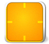 |
qgn_plat_clock_analog_plain.png | 100x90 |
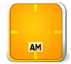 |
qgn_plat_clock_analog_am.png | 100x90 |
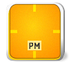 |
qgn_plat_clock_analog_pm.png | 100x90 |
Digital Clock:
| Preview | File name | Size |
|---|---|---|
 |
qgn_plat_clock_digital_background.png | 100x90 |
 |
numbers from 0 to 9 normal and focused: qgn_plat_clock_digital_display_number_0.png qgn_plat_clock_digital_display_number_0_focused.png |
16x30 |
 |
qgn_plat_clock_digital_display_separator.png | 16x30 |
 |
2 images on for normal other for focused state qgn_plat_clock_digital_label_am.png qgn_plat_clock_digital_label_am_focused.png |
30x20 |
 |
2 images on for normal other for focused state qgn_plat_clock_digital_label_pm_focused.png qgn_plat_clock_digital_label_pm_focused.png |
30x20 |
Adding new fonts
First you need to create the user's fonts folder:
        cd /home/user/
        mkdir .fonts
To add new fonts is pretty simple: just place your font files ( .ttf or type1) in the fonts folder located on:
/home/user/.fonts/
After that your fonts will be available on the font selector dialog. To change the fonts used by the whole system, you should modify it on your theme.xml file explained in the Understanding the Maemo UIsection.
Task Navigator Icons
The main icons used in Maemo, such : Internet browser, Application menu, Mail and the status bar icons can be modified by other images just by changing the images on the following dir:
/usr/share/icons/hicolor/scalable/hildon/
The Mail and Browser icon are only available on the product firmware.
You can customize the icons by changing the following images. Again, don't forget to back them up first and always use the same file format and image size. All icons are 8bit, 64x54 pixels png images.
| Preview | Description | File name |
|---|---|---|
 |
Contacts | qgn_grid_tasknavigator_contact.png |
 |
Active Contact | qgn_grid_tasknavigator_contactactive.png |
 |
Mail / Inbox | qgn_grid_tasknavigator_inbox.png |
 |
New message | qgn_grid_tasknavigator_newmessage.png |
 |
Sending / Receiving | qgn_grid_tasknavigator_sendrecieve.png |
 |
Web Browser | qgn_grid_tasknavigator_web.png |
 |
Others / Menu | qgn_grid_tasknavigator_others.png |
Status bar icons
You can also customize the status bar icon. Battery status, volume status, connection and phone are multiple state icons so be sure to customize every single state image.
Files are located on the folder:
/usr/share/icons/hicolor/40x40/hildon/
| Icon | File name | Icon | File Name |
|---|---|---|---|
 |
qgn_stat_battery_full100.png |  |
qgn_stat_displaybright4.png |
 |
qgn_stat_battery_full75.png |  |
qgn_stat_displaybright3.png |
 |
qgn_stat_battery_full50.png |  |
qgn_stat_displaybright2.png |
 |
qgn_stat_battery_full25.png |  |
qgn_stat_displaybright2.png |
 |
qgn_stat_battery_low.png |  |
qgn_stat_usbact.png |
 |
qgn_stat_battery_verylow.png |  |
qgn_stat_alarmact.png |
Battery, Brightness, USB and Alarm icons listing.
| Icon | File name | Icon | File Name |
|---|---|---|---|
 |
qgn_stat_internetconn_generic.png |  |
qgn_stat_volumelevel4.png |
 |
qgn_stat_internetconn_adhocwlan.png |  |
qgn_stat_volumelevel3.png |
 |
qgn_stat_internetconn_datacall.png |  |
qgn_stat_volumelevel2.png |
 |
qgn_stat_internetconn_packetdata.png |  |
qgn_stat_volumelevel1.png |
 |
qgn_stat_internetconnection_no.png |  |
qgn_stat_volumelevel0.png |
| . | . |  |
qgn_stat_volumemute.png |
connection and volume icon listing
| Icon | File name | Icon | File Name |
|---|---|---|---|
 |
qgn_stat_gatewayconn_connected.png |  |
qgn_stat_gatewayconn_notselected.png |
|
qgn_stat_gatewayconn_connected.png |  |
qgn_stat_gatewayconn_flightmode.png |
Telephone connection icon listing
Advanced customization: Theme creation
Now its time to start the real customization. Creating themes is not difficult, but it takes a little bit of time to theme every single themeable element on the platform.This how to will show you how to customize the most important elements. This will allow will to understand how theming works on Maemo and how a complete new skin can be created.
all Maemo themes are located on the following directory:
/usr/share/themes/[Theme_name]
All themes must share the same structure and it has a pretty straightforward meaning:
      gtk-20/
          gtkrc
          gtkrc.cache
      images/
          *.png
      matchbox/
          theme.xml
      index.theme
Starting a custom Theme
To start your first theme in the simplest way, you should create a new dir, with your theme name, and then copy the files from the default theme to it. The Default maemo theme is the best way to start your theme. In the future a better guideline can be developed and be published on the site, but for now the default theme is the best starting point.
Steps for starting your new theme. Which we are going to name "Golden":
      :~# cd /usr/share/themes/
      :/usr/share/themes# mkdir Golden
and then copy everything from the default theme:
:/usr/share/themes# cp -r default/* Golden/
You can now start customizing the new theme. In this how-to will only make the new theme a variation of the Default theme but with a new color.You can download the theme from the site. You could also use your favorite editor to change the image's color/saturation/hue as you like, and then copy the images back to the folder images.
After downloading or creating your new images, it's time to send them to your theme folder with a SCP command or copying to a mmc and then moving it to the /usr/share/themes/Golden/images/ folder.Now you need to make some changes on the theme's theme.xml file:
Open the file theme.xml on the matchbox folder of your theme's directory and change the first line:
< theme name="YourThemeName" author="YourNameHere" desc="" version="1.0" engine_version="1" >
Now open the file index.theme on the your theme directory and change the following items:
Type=X-Hildon-Metatheme
  	Name=YourThemeName
  	Icon=/usr/share/themes/YourThemeFolderName/images/qgn_plat_theme_thumbnail.png
  	Encoding=UTF-8

  	[X-Hildon-Metatheme]
  	GtkTheme=YourTheme
  	IconTheme=default
  	X-MatchboxTheme=YourTheme
  	X-OperaSkin=default.zip // this will only exist on the product firmware
Save it and close it.
Testing your Theme
If you are using the product firmware, use the personalization tool in the control panel or the personalization item in the home screen's main menu.
If you are in the Maemo SDK version you can:
Do it manually in the shell (x-term) or ssh:
-
Edit the following file:
/home/user/.osso/current-gtk-theme
Change the only line to point to your theme:
include "/usr/share/themes/Golden/gtk-2.0/gtkrc"
-
Run the following commands in the shell:
export DISPLAY=:0
matchbox-remote -keys-reload
matchbox-remote -t YourThemeName
reboot your device ( tasknavigator, background and statusbar reload)
Use the free theme changer
Uou can use this simple theme change to avoid typing that in the shell and when editing the theme directly on the device.
-
Get the theme changer .deb package at:
www.marceloeduardo.com/me/files/personalization_0.1_all.deb - Install it using the application installer
- Run it from the application menu -> extra -> personalization
This is how your theme looks like:
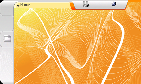
Golden theme in action
Now you are able to the see the differences and test your theme. Go to some complex application and see if everything is running fine.
Understanding the Maemo UI: Theme.xml
So now you have your theme running, but batch editing only change images colors or saturation is nothing like real theming. To be able to do real themes you must understand how the main GUI elements in Maemo are built and how they relate to each other.
All these Elements (controls not included) are defined in the gtkrc file and in the theme.xml. First, a simple overview of Maemo GUI:
Maemo GUI overview
You can check out more about the Maemo UI on the Maemo Tutorial - Gui applications [8] and in the UI style guide[9]
This shows how a basic theme can be created by modifying the default theme. But if you want to go further you will need to tweak this theme.xml for real. Hacking the theme.xml file
Some simple window decoration customization can be achieved by modifying the theme.xml. In the Maemo platform the theme.xml defines the Main title bar decoration and some dialogs decoration as well. You can also refer to the Matchbox theming tutorial for more info about theme.xml files[10]. Basic resources
There are 3 basic resources in a theme.xml file: colors, fonts and pixmaps. You need to declare them all before using. The syntax is pretty straightforward:
For colors:
< color id="lowlightcol" def="#d4e6fd80" />
basically is an "id" followed by a definition, the element real value.
For fonts:
< font id="osso-TitleFont" def="Nokia Sans-16.75:30px" />
or
< font id="osso-TitleFont" def="Nokia Sans,fixed bold 16.75" />
again an id and a definition. In font elements you can also define alternative fonts by separating them with "|" (pipe). The first match will be used.
For Pixmaps ( images ):
< pixmap id="dialoguptile" filename="../images/qgn_plat_note_frame_tile_top.png" />
Plain simple: Id followed by a filename, pointing to a png image.
Example of a simple theme.xml file:
<?xml version="1.0"?>
<theme name="Golden"
         author="Marcelo Oliveira"
         desc="First maemo variant theme"
        version="1.0" engine_version="1">

    <color id="lowlightcol" def="#d4e6fd80" />

    <font id="osso-TitleFont" def="Nokia Sans-16.75:30px" />

    <pixmap id="titlebarclosebutton" filename="../images/qgn_plat_button_close_normal.png" />
    <pixmap id="titlebarclosebuttonpressed" filename="../images/qgn_plat_button_close_pressed.png" />

    <!-- frame definitions will go here -->

    </theme>
Customizing Matchbox Frames
Now you can start modifying the Matchbox frames elements. In Maemo this will allow will to modify the main title bar and the dialog decorations. These modifications will allow you to make real modifications also on the minimize and close buttons and application menu launch area.
TitleBar
The main title bar is always visible (when not in the fullscreen mode) and gives you the: foremost application's menu, the background for the status bar and the close and minimize buttons. The code for the title bar (default theme) is defined in the following section of the theme.xml file:

<!-- Main windows title bar. You need to define its height -->
<frame id="main" height="60">
  <layer x="0" y="0" w="720" h="60"  type="pixmap" pixmap="applicationtopbararea"/>
  <layer x="35" y="8" w="283" h="30"  type="label" color="osso-TitleTextColor" justify="left" font="osso-TitleFont" />
  <!-- Define the area that launches application menu -->
  <button x="3" y="0" w="315" h="60" action="custom" options="inputonly,pressonly" />
  <!-- Define the status bar applet panel -->
  <panel x="-372" y="2" w="280" h="40" />
  <!-- Define minimize and close buttons -->
  <button x="-80" y="2" w="40" h="40" action="minimize" >
    <active pixmap="titlebarminimizebuttonpressed"/>
    <inactive pixmap="titlebarminimizebutton"/>
  </button>
  <button x="-40" y="2" w="40" h="40" action="close" >
    <active pixmap="titlebarclosebuttonpressed" />
    <inactive pixmap="titlebarclosebutton"/>
  </button>
<!-- w="127" is result of trial and error testing and limits the maximum
     width of the whole title area to the value specified. It is quite
     possible that this is not the exactly correct value. -->
  <layer x="labelend+27+6" y="9" w="127" h="30"
   type="sublabel"/>
</frame>
Remember that pixmaps and others resources as colors and fonts are defined in the beginning of the file.
Dialogs
The next frame element defined in the theme.xml file is the Dialog. It defines the look and fell using the following images:
| Preview | File name | Dimensions |
|---|---|---|
 |
qgn_plat_dialog_frame_corner_top_left.png | 51x51 |
 |
qgn_plat_dialog_frame_corner_top_right.png | 51x51 |
 |
qgn_plat_dialog_frame_corner_bottom_left.png | 20x20 |
 |
qgn_plat_dialog_frame_corner_bottom_right.png | 20x20 |
 |
qgn_plat_dialog_frame_tile_left.png | 10x2 |
 |
qgn_plat_dialog_frame_tile_right.png | 10x2 |
 |
qgn_plat_dialog_frame_tile_top.png | 2x51 |
 |
qgn_plat_dialog_frame_tile_bottom.png | 2x10 |
Images used in the dialogs.
Please refer to the Matchbox tutorial to learn more about modifying the supported window types.[10]
Titlebar and Dialogs Fonts customization
After placing custom fonts on your fonts folder, you can know modify the theme.xml to make those fonts the default fonts in the system. The following resources define the system fonts for:
Lines 29 to 32:
        <font id="osso-TitleFont" def="Nokia Sans-16.75:30px" />
        <color id="osso-TitleTextColor" def="#303030" />
        <color id="osso-DialogTitleTextColor" def="#ffffff" />
gtkrc customization
After modifying your theme.xml and the basic images that are used to create the main toolbar background and decoration for dialogs, the next step on Maemo customization and Theming is to modify the GTK resource file and the resources used by it. This will enable you to change the visual of the almost everything else in your system, including the Hildon[11] widgets.
Even with the gtkrc file giving you control over some important things, it's recommended to modify only the images on your folders that are used by the gtkrc file.The gtkrc file is to big to describe on full details on this how to. This document will keep to showing the most important UI elements components. It will list the images that compose. Customize them to improve more your theme.
Modifying System-Wide Colors
You will need to change some sections of the gtkrc file to match your theme's colors. Most color definitions are located in the beginning of the file. Be careful to do not enter invalid values. if possible always test it on your Scratchbox first. Color definitions are located in the following lines:229 to 280
Modifying System-Wide Fonts Like the colors, you can modify the gtkrc file to put some custom fonts to work on UI. Again it is very important to use the correct font name and size or you can damage your rootfs. Font definitions are located in the following lines: 282 to 322
style style-Identifier{ font_name="Font Name size"}
Sample of font definition:
style "osso-SystemFont" { font_name = "Nokia Sans 16.75"}
and font usage:
class "*GtkComboBox" style "osso-SystemFont"
Note that this is just a very simple introduction to gtk resource files. You should always refer to the GTK documentation [12] if any doubts about resource files comes out.
Modifying the main View / home view
The main view is the first thing you should customize. It has the basic "decoration" that your theme will use and still pretty simple. This view is composed by only the border around the main elements in this screenshot:
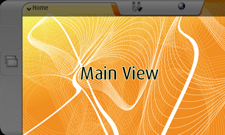
The main view uses the following images:
| Preview | File name | Dimensions |
|---|---|---|
 |
qgn_plat_application_frame_bottom.png | 50x24 |
 |
qgn_plat_application_frame_right.png |
24x2 |
 |
qgn_plat_application_frame_left.png | 24x2 |
And is defined in the following section of the gtkrc file:
line: 4012 style "osso-appview-background"
Tasknavigator
The Task Navigator is located in the left side of the screen. It provides fast access to the most important one-hand use cases such as launching new applications, switching between them, going to a bookmarked web page, or reading incoming email messages.
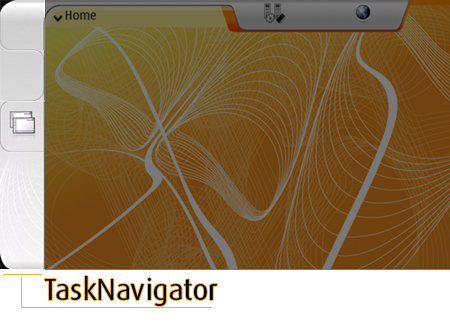
It uses the following images on it's normal state:
| Preview | File name | Dimensions |
|---|---|---|
 |
qgn_plat_task_navigation_button_01_normal.png | 80x90 |
 |
qgn_plat_task_navigation_button_02_normal.png | 80x90 |
 |
qgn_plat_task_navigation_button_03_normal.png | 80x90 |
 |
qgn_plat_task_navigation_skin_01.png | 80x10 |
 |
qgn_plat_task_navigation_application_switcher_01_normal.png | 80x38 |
 |
qgn_plat_task_navigation_application_switcher_02_normal.png | 80x38 |
 |
qgn_plat_task_navigation_application_switcher_03_normal.png | 80x38 |
 |
qgn_plat_task_navigation_application_switcher_04_normal.png | 80x38 |
 |
qgn_plat_task_navigation_application_switcher_05_normal.png | 80x38 |
 |
qgn_plat_task_navigation_skin_02.png | 80x10 |
In the SDK version the Tasknavigator is placed a little bit above, so the first and second images doesn't appear. The Tasknavigator is defined in the following section of the gtkrc file:
line: 5255 style "osso-navigator-button-one"
Full Customization: Widgets
All Widgets images are located inside the images folder on each theme. So, if you want to customize them too, just browser the images, modify and replace in your folders themes. For this simple customization, do not change image's size and always save them as 8 bit pngs.
Distributing themes
Now you are be able to distribute your theme as an application installer ready package. this will make easier for end users to install and uninstall themes.
In the previous version of Maemo, the themes could only be installed manually. Today you can set the correct installation path to your .deb package.
You can also distribute your themes is like an tar.gz file containing your theme folder and it's structure. The user just need to untar the files in the themes folder and activate the theme. Please refer to the "Testing your theme section".
More to come
This is only the start point for themeing Maemo. expect more information in the future. We would also like to hear about other customizations from you on the Maemo Wiki
References
- Maemo 2.2 Tutorial : http://maemo.org/development/documentation/tutorials/Maemo_2.2_Tutorial.html
- Usb Networking : http://maemo.org/development/documentation/how-tos/2-x/howto_usb_networking.html
- Matchbox project : http://projects.o-hand.com/matchbox/
- HowToBecomeRoot : http://maemo.org/maemowiki/HowDoiBecomeRoot
- X term : http://770.fs-security.com/xterm/
- Open SSH : http://maemo.org/maemowiki/ApplicationCatalog
- RD mode : http://maemo.org/development/documentation/how-tos/2-x/howto_use_flasher_rootfs.html
- Maemo 2.2 Tutorial GUI : http://maemo.org/development/documentation/tutorials/Maemo_2.2_Tutorial.html#gui
- Hildon UI Style guide : http://maemo.org/forrest-images/pdf/UI_Style_Guide_Summary_2.0.pdf
- Theme.xml tutorial : http://projects.o-hand.com/matchbox/documentation/themes/
- Hildon widgets : http://test.maemo.org/platform/docs/api/hildon-docs/html/ch02.html
- GTK resource files : http://test.maemo.org/platform/docs/api/gtk/gtk-Resource-Files.html
More useful information:
- http://standards.freedesktop.org/icon-theme-spec/icon-theme-spec-latest.html
- Understanding GTKIconTheme : http://test.maemo.org/platform/docs/api/gtk/GtkIconTheme.html
- GTK themeable stock images : http://test.maemo.org/platform/docs/api/gtk/gtk-Themeable-Stock-Images.html
- Themeable Comom Toolbars and menu Icons : http://test.maemo.org/platform/docs/api/gtk/gtk-Stock-Items.html
- hardcore widgets theming / modification: https://stage.maemo.org/svn/maemo/projects/haf/trunk/hildon-libs/hildon-widgets/
Improve this page