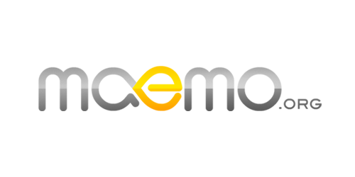
maemo.org logo contest results
The judges have spent a lot of time over the past few days considering the entries for the logo contest. The standard was very high, and we had a tough time whittling down the possibilities. A great number of good logos didn't make it to final consideration.
First, we want to give a special mention to 3 logos which made our final shortest of shortlists:
- Peres 1:
-

- Thiercito 8 (rounded variant):

- Jussi 16:

And finally, the winner of the logo contest is:
- glaoliver 1:

We felt that the winning logo was modern in appearance, had great potential with variants (looks great as plain colour), and represents a number of ideas behing the maemo.org community. The joined letters suggest collaboration, the open loop on the A suggesting openness, and the infinity of the ae ligature suggesting continuity.
Thank you all again for your magnificent work! You made the judge's job very hard, which is the highest compliment I can pay you all.
Comments:
I really like all four logos, and there are a couple others that I think also deserve mention. Perhaps in a follow up post? (to highlight interesting concepts in the various entries)
What I appreciate the most from Glauber is that he was really able to envision his logo on all sorts of things, as if he had already won. The concept art is great.
Congratulations Glauber, you deserve it!
Jon
Comments:
You must be logged in to make comments.


